Did you know that when a potential client lands on your Contact page to fill out a form, they are an incredible 70% of the way to making a purchase? If your main contact page is poorly laid out, the content does not inspire confidence, or the contact form itself is not mobile friendly, it can result in the loss of potential customers that may have been about to convert.
The Contact Us page is a very important (landing) page yet it is mostly ignored. Despite its importance, many businesses do not pay much attention to its style, layout or ways to maximize its full potential.
In this article, we will present our top tips on how to create a great contact us page and the pitfalls to avoid. We will also share some inspiring examples of Contact Us pages we’ve developed with clients to maximize conversions.
What is a Contact Us Page Anyway?
It is a page on the website where visitors can easily find out how to get in touch with a brand such as through an email, a phone number, or a Google Maps location. It usually has a contact form where people can fill in their queries along with their contact information.
This page may be given a conversion-focused title like “Book A Consultation Page” or “Get Started Page.” Depending on your branding or type of business, you have the flexibility to some degree on the title of this page.
How important is it to make it easy for a visitor to connect with you? Your prospective customers will trust a business that is easily approachable and responds to their feedback. The Contact Us page is a place where they might want to leave a question, complain about a service or ask for more information through a contact form. Businesses can leverage this point of contact in a variety of ways.
If you respond to the queries asked in the contact form, you have more chances of building trust and increasing engagement. According to a survey, 89% of customers are willing to buy from a business that answers queries online. Furthermore, 93% of customers are willing to spend more if they are offered an option to contact a business online through a contact form.
On the other hand, if your business website is missing a contact us page or you do not respond to the people who fill in your contact form, you might be missing out on a huge opportunity to convert these potential customers.
A contact us page can also help you to collect more leads. Whenever a potential customer lands on your business website, she is probably looking for a solution to a problem. By filling in the contact form, she probably wants to find out if your business can provide that solution.
At NSDS, we help clients to create amazing contact forms to do the vetting for them. We include questions for the prospects to answer that help you to know if the prospect is a good fit and help the prospect know if they are in the right place.
How can you write a great Contact Us page that reflects your brand and boosts conversion? The following are some tips and the best practices that can work:
Tips To Write A Great Contact Us Page
Here are some useful tips that will make your Contact Us page pop.
1. Complete and Accurate Contact Information
The main goal of a Contact Us page is to make your website visitor fill in a Contact Us form for leaving a question, making a complaint or enquiring about a service. However, it should also provide all the other relevant, accurate business information to the clients like:
- Operational Hours
- Email address and Phone number
- Response time
- Contact info, location, and address
The contact us form should collect important information about the prospect for the business owners. It should find out the following:
- Who the prospect is (a referral, a returning client, a vendor etc.)
- Which services is he interested in.
- How did they discover your business.
- Contact information like an email address or a phone number.
2. Multiple “Contact Us” Options
Offer your site visitors more than one way to connect with you. Some options besides Contact Us form are e-mail, phone numbers, social media pushes, and chat boxes. If you want to give 24/7 support to your customers then using self-service tools, AI-powered chat, or FAQs are some good options as well.
3. Remove Unnecessary Fields But Keep The Relevant Ones
Several studies suggest that when you lower the number of fields in a contact form, more people find it easier to fill it in and you get more submissions. However, that is not the ultimate goal of contact forms.
The purpose of these contact forms is to get leads that have a higher potential for conversion. To achieve that goal, the focus should not be on the number of fields but on their relevance. A good point to start with is to eliminate unnecessary fields and leave those sections that collect important information about your client.
A well-designed and succinct contact form can help you identify leads that have the potential to convert. At NSDS, we help our clients to design to-the-point and highly effective contact forms. Our contact forms stand out due to smart copy, to-the-point questions, right length, and appropriate design.
4. Uniqueness And Consistency
Make your Contact Us page unique through careful and well-planned web copy. For example, Frida, a well-known baby care brand, makes its Contact Us page stand out by using humorous phrases like “the fuss?” and “Need to have an adult conversation?”
If you want to replace the phrase “Contact Us” with some other phrases, the following is a list of ideas:
- Drop Us a Line
- Get in Touch
- Reach Out
- Let’s Chat
- Talk to Us
You can use any of the above mentioned creative ideas in the navigation bar or in the web copy. However, the H1 tag and URL should be optimized with the right keyword for improved ranking.
While being creative with web copy, don’t forget to be consistent. The copy and style of the Contact Us page should be in line with the copy on other web pages.
5. Easy to access
You might have a great Contact Us page but it is of no use if your prospective customers can’t find it. Place the link to the page in a way that makes it easy to access. Some of the great places to put the Contact Us page link are:
- Navigation Bar: The navigation bar is an ideal place to put the link to your contact us page. Many websites put the contact us page last in the navigation. It is because website visitors follow a natural pattern whenever they land on a website. First, they determine if this website can solve their problem by visiting the service pages and blog. Finally, when they are ready to take action, they visit the Contact Us page.
By strategically placing the contact page link in the navigation bar, you can make it easier for your potential customers to connect with you through this page.
- The footer of the home page: The link to the Contact Us page could also be placed in the footer of the page.
- Link in About Us page: Another great way to place the Contact Us page link is on the About Us page. You can include it as a Call-to-Action on the About Us page or as a hyperlink in the content of the page.
- Sidebars of all pages: Sidebar is a column placed to the right or left of a web page’s primary content area. It provides the users with all the widgets in one place. They are not a very popular choice these days as this multi-column design is supposed to add clutter to the web page. However, many people still use it to display units of the organization like menus, options, links, etc. If your website uses sidebar navigation, you can place the link to the Contact Us page there.
6. Live Chat
Introducing a live chat button is a great way for customers to get connected with a brand on a more personal level. It also assures them that they are going to get assistance from real agents. For example, the Contact Us page of Netflix has a live chat button that connects its visitors to its support team.
7. A Search Bar to Find Answers
You can add a search bar in your Contact Us page to help people find out the answer to a frequently asked question. The bar is usually placed under H1. For example, the Contact Us page of Kohl has a search bar under the question “How can we help?” This helps the users to quickly find out their required information.
8. Use A Map
We normally embed a Google map in the footer of every page. However, a few businesses do not prefer to use it on every page. We recommend using it on the contact us page for every business website as a geographic reference so that people could understand where you are located.
9. Include The Resources And Helpful Information
You can include links to important resources or helpful blog articles on the Contact Us page. Another great way to link your potential customers to important information is to add FAQs to this page. For example, the contact us page of Uniqlo lists important FAQs on their contact us page.
Pitfalls To Avoid
1. No Contact Us page
The Contact Us page is one of the most important tools for connecting you with customers. Besides providing important information about your business, it should allow your prospective clients to book a consultation through a third-party app like Calendly. The contact form on the page enables your visitors to ask a question or leave a complaint. If you do not have a Contact Us page, you are missing out on an opportunity to connect with your audience and convert them.
2. Inadequate Contact Forms
The purpose of a Contact Form must be kept in mind while designing it. Are you trying to collect feedback on a service? Are you trying to get them to book a consultation? If you have multiple purposes to achieve, you can have more than one contact form on the page as on the Contact Us page of Pro Health Physicians.
Avoid questions that require sensitive information like social security numbers or information about their medical conditions. Avoid lengthy forms that would take a lot of time to fill in. Try not to use very generic forms. One way of making your forms user-friendly as well as helpful is to add conditional logic to them. This means that the form fields will vary according to the responses of the clients.
3. Unclear Names or CTAs
Avoid ambiguous or unclear names for the Contact Us page. Searching your Contact Us page should be a piece of cake for your customer. If you are trying to be creative with web copy, ensure that it is consistent with your brand voice.
4. No Spam Protection
Don’t forget to use spam protection on your website like CAPTCHA. CAPTCHA is a great way to block spam contact form submission from bots. By verifying that a human user is submitting a form, the spam attempts are blocked. Your users feel confident to fill in their information and it helps reduce form abandonment.
5. Missing Marketing Optin Or Privacy Policy Check-In
Many contact forms are not GDRP compliant. GDRP stands for General Data Protection Regulation and requires businesses to take consent of the subscribers before storing any of their personal information or sending them marketing materials. One way of making your contact forms GDRP compliant is to add a marketing opt-in and privacy policy check box. When they click those boxes, you are legally safe to store their entered information or send them automated marketing emails.
6. Lack Of CMS Integration With Contact Form
One of the most common mistakes a lot of businesses make is that they never integrate their contact forms with a CMS (Content Management System). Consequently, the submissions might get unnoticed or not be followed up on properly. At a minimum, we recommend using a service like MailChimp that has a free entry-level offer. Compiled information can be migrated to another service later on like ActiveCampaign if the business needs begin to scale.
Inspiring Contact Us Page Examples
At North Star Design Studio, we routinely develop responsive, user-friendly, and optimized websites for service-based businesses. Have a look at some of the Contact Us pages from some of our clients’ websites for inspiration.
Ex: KidSense Therapy Group
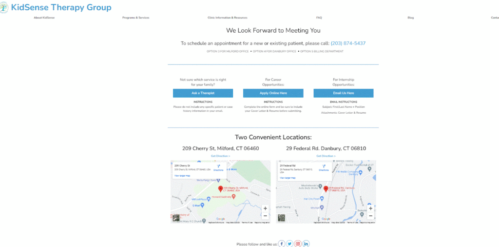
KidSense Therapy Group has an outstanding Contact Us page. Starting with a simple and easy-to-understand header, “We Look Forward To Meeting You,” they provide their phone number, which is the most common way their clients reach them.
Most of their clients come to this page with one problem i.e. they are not sure which kind of therapy their child needs. That is why this question is addressed right in the beginning along with a CTA “Ask the Therapist.”
People also contact them for seeking job opportunities and internship opportunities so there are separate CTAs for these two groups of people that lead them to their relevant Contact Forms.
Their clients need to visit the clinic to get the therapy so they added Google Maps on this page to make their facilities accessible. The page also has social media icons and phone numbers.
It is also to be noted that they do not have a contact form on their web page because they offer health services. Some users might get confused and send sensitive information through a general contact form. To avoid this, users are given specific instructions about what not to send via email as well as other questions about important communication methods.
Ex: EC Tree Service
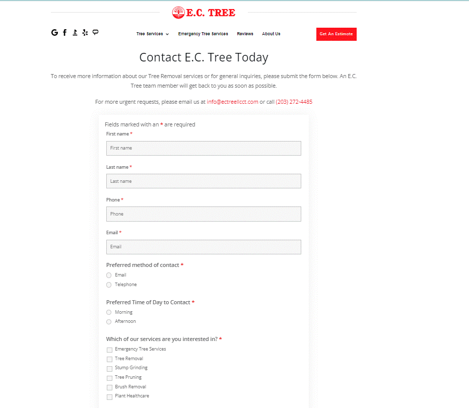
EC Tree service has a very effective and user-friendly Contact Us Page. Most people contact them to get an estimate about the services they are seeking, so the text on the button on their homepage is “Get an Estimate.” When a potential customer lands on their page, she is prompted to fill in a contact form, “To receive more information about our Tree Removal services or for general inquiries, please submit the form below. An E.C. Tree team member will get back to you as soon as possible.”
The contact form collects the contact information of their potential clients as well as asks about their preferences and which services they seek. One of the most effective features of their contact form is that they have included mandatory fields related to the services they offer. This means that the users cannot request service that EC Tree doesn’t offer. This way, they collect leads that have a great potential to convert. The potential customers also get an idea of whether they are connecting with the business that could provide the solution they are looking for.
Ex: Green Apple Spray Foam
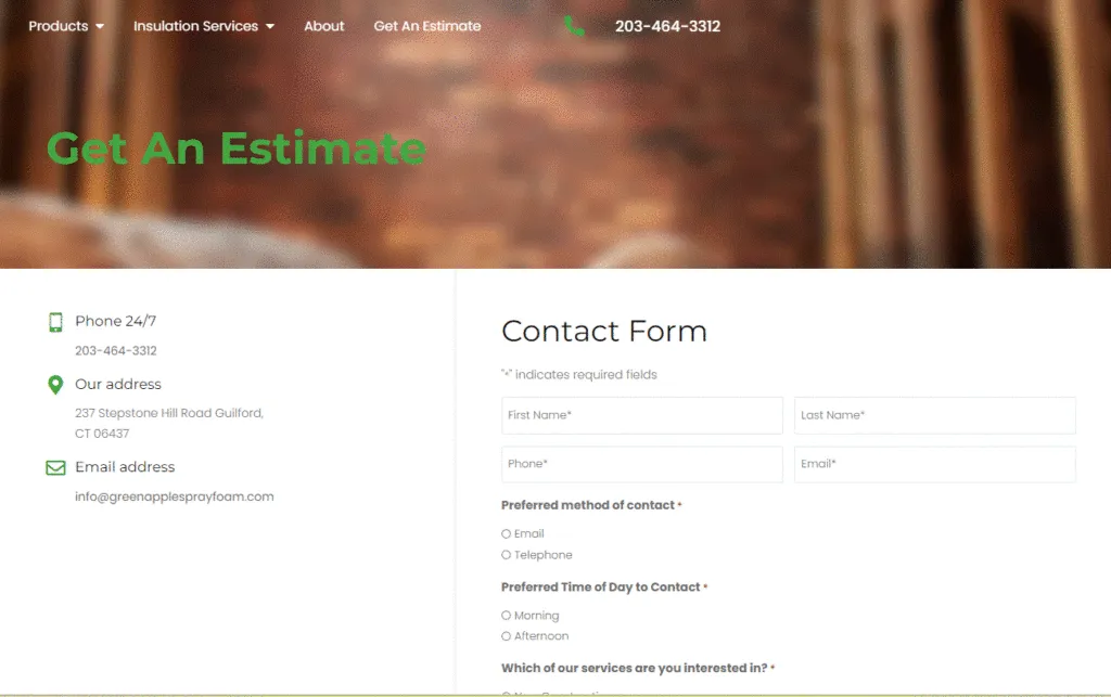
The Contact Us page of Green Apple Spray Foam does a wonderful job by listing important business contact information on the sidebar such as their address, phone number, and e-mail address. The middle of the page has a contact form that prompts the user to provide their contact information as well as which services they are interested in. The embedded Google Map can help their potential customers to find them conveniently.
Google Maps can also help in local SEO. Search engines rank those websites higher that provide NAP (Name, Address, Place) Google Maps communicate your location to search engines and is likely to be seen as a positive attribute.
Ex: Rushlow Wellness
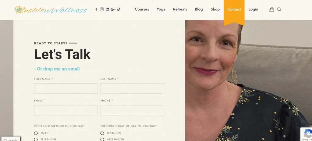
Based in Connecticut, Rushlow Wellness is a service-based business that offers state-of-the-art coaching services. Their Contact Us page is in line with their brand message and has an image of coach Amy Rushlow in the header. The form on the page collects important information from potential clients as well as the services they are interested in. The form also provides an option to sign up for receiving a newsletter.
One of the great features of their contact form is the opt-ins for marketing and the privacy policy prompt at the bottom. The privacy policy is not pre-checked but it is mandatory. The marketing opt-in is not mandatory but it is pre-checked. Policy agreement is particularly important to the services offered on this site. When users agree to it at the onset, it becomes a key to streamlining Rushlow’s Services.
When users opt in to receive marketing emails, they start receiving automated follow-up messages immediately. This enhances user experience and improves overall conversion rates.
Ex: North Star Design Studio
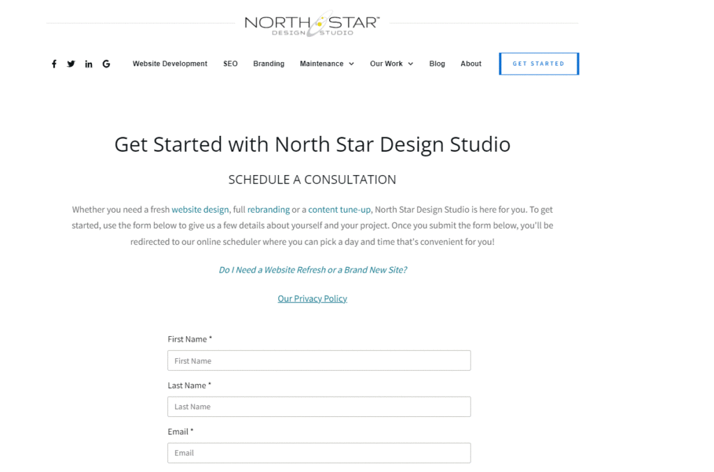
The Contact Us page of our own website has a great design, layout, and copy (in our opinion, lol). The button that leads to it is quite visible in the top menu on the home page. The content under the first header is hyperlinked to lead to our two most important service pages “Website design,” and “SEO content writing.” Before a potential client starts filling up a form, she is also informed that she would be led to an online scheduler for booking a consultation. In this way, users know exactly what to expect. Clear, simple communication and perfect follow-up are part of the ‘north star’ experience and essential to setting expectations for prospects.
Most of prospective clients have the same query when they fill in this form i.e. “Do I need a website refresh or a brand new site?” We have addressed this commonly asked question in one of our in-depth guides and placed its link right at the top of the page. Our clients can also find a link to our privacy policy there.
The contact form on our page is brief and effective. We also allow our potential customers to upload any file such as a logo, collateral, or supporting documentation when they book a consultation as often they’ve prepared project briefs in advance.
Conclusion
No matter which industry you are in, your business website needs an actionable Contact Us page. Landing on this page and filling in the form is perhaps the most important step your prospects will take to know your business better. A well-planned, and well-executed web design can guide your visitors through their buying journey to conversion, so use these tips to optimize your Contact Us page.
Are you looking forward to redesigning your Contact Us page? Book a free consultation today.
Glossary
H1 Tag: The H1 is an HTML tag that indicates the title of the website. For SEO purposes, it is optimized with a keyword. However, in many cases, it doesn’t look like the “title” on the webpage.
URL: It is the address of a web page. Most of the URLs are composed of the protocol, domain, subdomain, and slug. For example, the URL of this page is https://www.northstardesign.studio/pro-tips-design-blog/how-to-write-an-about-us-page-7-surefire-tips-examples/
- Protocol: https
- Domain: northstardesign.studio
- Subdomain: /blog
- Slug: Contact Us Page Design: 9 Amazing Tips Examples
- For SEO purposes, the slug is optimized with the main keyword, which is this case is “Contact Us Page Design”